
Data collection and analysis (GCSE)
KS4 National Curriculum Statement(s) covered
- Making and recording observations and measurements using a range of apparatus and methods. (WS)
- Applying the cycle of collecting, presenting, and analysing data [...] (WS)
- Evaluating methods and suggesting possible improvements and further investigations. (WS)
Skip to:
Understanding how to collect, analyse, and communicate data is essential in chemistry. This entry will guide students through the process of gathering observations, presenting data, performing analyses, interpreting results, and communicating findings effectively. Statistics, the science of collecting, analysing, interpreting, and presenting empirical data, is integral to these processes. Mastering these skills is fundamental to conducting scientific experiments and reporting accurate results in chemistry.
Data Collection
Data is any information collected during an experiment, including measurements, observations, and qualitative descriptions. In chemistry, this data can be categorized as quantitative or qualitative, and further as discrete or continuous:
- Quantitative data is numerical and can be measured, such as temperature, volume, and mass.
- Discrete data: Countable data, often integers (e.g., number of bubbles produced in a reaction).
- Continuous data: Data that can take any value within a range (e.g., temperature, time).
- Qualitative data is descriptive and can be observed but not measured. Examples include colour changes, precipitate formation, and changes in state.
To ensure precision and accuracy in data collection, it is important to use appropriate apparatus. For example, when using a burette, measurements should always be reported to two decimal places where the second decimal value is a 0 or 5. Precision is achieved through consistent use of equipment, and accuracy is ensured by calibrating instruments properly and following correct measurement techniques.
Anomalous data, or outliers, are results that do not fit the expected pattern. It's important to identify and consider these in your analysis. Good experiments often involve multiple runs to calculate a mean, which helps in reducing the impact of anomalous data and provides a more reliable result. If identified, outliers should not be included in the calculation of the mean. This ensures that the data analysis reflects a more accurate and reliable result.
Worked Example - Recording Results
Hypothesis: "If the temperature of the reaction mixture increases, then the rate of reaction between sodium thiosulfate and hydrochloric acid will increase."
When recording data in a table, it is essential to format it correctly. Independent variables typically go in the leftmost column, with dependent variables in subsequent columns. Units should be included in the column headers, not within the table cells. The titles for each column should be clear about what was being measured.
Here is an example of how to record reaction times at different temperatures:
| Time for cross to disappear (s) | ||||
|---|---|---|---|---|
| Temperature (°C) | Run 1 | Run 2 | Run 3 | Mean time (s) |
| 20 | 125 | 115 | 120 | 120 |
| 30 | 85 | 95 | 90 | 90 |
| 40 | 55 | 65 | 60 | 60 |
| 50 | 50 | 40 | 100 | 45 |
To calculate the mean time for each temperature:
- Add up the times: For each temperature, sum the times of each run.
- Divide by the number of runs: Divide the total by the number of runs to find the mean.
Example for 20°C:
However the data for 50°C includes an anomaly. The 100 s result is an outlier. We should exclude it from the mean calculation:
Errors in data
Random errors are caused by unpredictable variations in the experiment, such as slight temperature fluctuations or minor inconsistencies in how measurements are taken. These errors can be reduced by taking multiple measurements and averaging the results.
Examples include:
- Temperature fluctuations: Room temperature changes can cause random variations in reaction rates.
- Human reaction time: Variability in starting and stopping a stopwatch introduces random errors.
- Electronic noise: Noise in electronic circuitry can cause small random fluctuations in readings.
- Parallax error: Slight differences in the angle of reading a measuring cylinder can introduce random errors.
Systematic errors are caused by consistent inaccuracies, such as faulty equipment or incorrect calibration. These errors can lead to biased results and need to be identified and corrected by using properly calibrated instruments and standardised methods.
Examples include:
- Calibration errors: An improperly calibrated balance will consistently give incorrect mass measurements.
- Instrumental error: A thermometer that reads consistently higher than the actual temperature introduces systematic error.
- Environmental conditions: Consistently higher ambient temperatures can affect the volume measurements in titration.
- Chemical impurities: Impurities in, or incorrect concentrations of, reactants can lead to consistently incorrect yields in chemical reactions.
Representing Data
Presenting data effectively helps in understanding and communicating findings. Data can be presented in various formats, such as tables, graphs, and charts, each serving different purposes.
Graphs are ideal for showing relationships between variables.
- Line graphs are useful for displaying continuous data and trends over time
- e.g. a line graph could show how the rate of a chemical reaction changes with temperature
- The x-axis represents the independent variable (e.g. time, distance, temperature), while the y-axis represents the measured dependent variable.
- Line graphs are excellent for visualising how data points are interconnected.
- A 'line of best fit' is often needed, which can be either straight or curved. This line should pass through as many data points as possible, though it may not intersect all of them. It helps to:
- Identify Patterns: Highlight the overall direction or trend in the data.
- Make Predictions: Estimate values for unmeasured points within the range of the data.
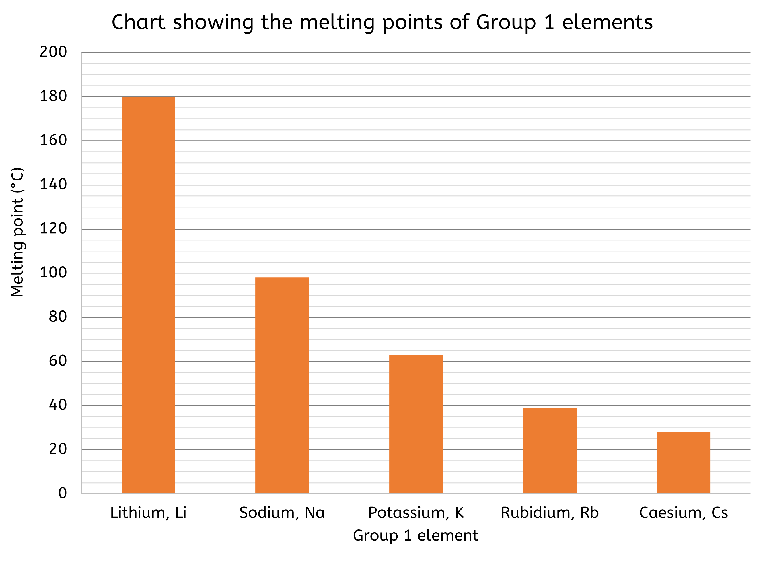
- Bar charts are better suited for comparing discrete data across different categories.
- e.g. a bar chart could illustrate the melting points of elements in the same group in the Periodic Table
- Bar charts display data as rectangular bars, where bar length represents the value of the data.
- Bar charts are effective for making comparisons between categories and highlighting the differences in data values.
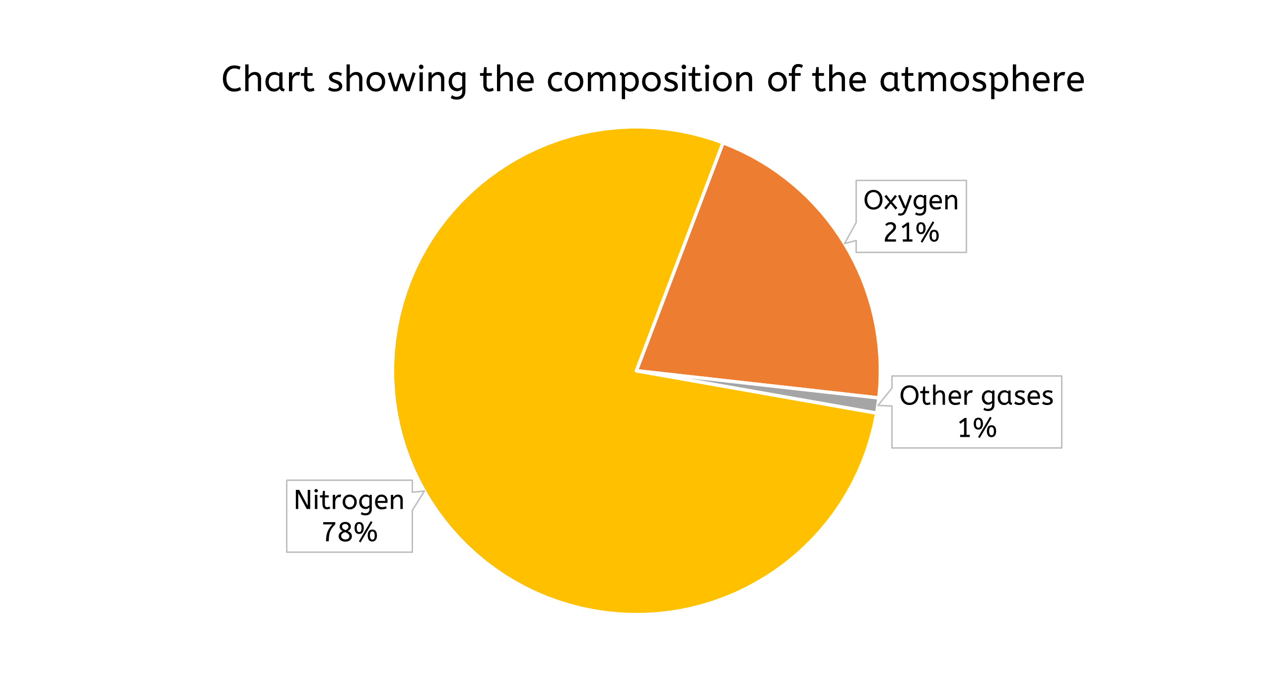
- Pie charts are effective for illustrating proportions of a whole. They display data as slices of a circle, with each slice representing a percentage of the total.
- e.g. a pie chart could show the composition of a mixture, such as the percentage of different gases in the atmosphere
- Pie charts provide a clear visual representation of how each component contributes to the whole, making it easy to understand the relative sizes of different parts.
Choosing the right type of data presentation depends on the nature of the data and the message you want to convey. For instance, a line graph would be appropriate to show how reaction rate changes with temperature, whereas a pie chart would be more suitable for displaying the composition of a mixture.
However, there are instances when data should not be presented in a graph. For example, if the data set is too small to show meaningful trends or if the data is all qualitative and better described in text (or left in a table).
When plotting data, it's important to identify and consider any anomalous data points. These points can skew the results and may need to be investigated further to determine if they are due to experimental error or an unexpected result. Any anomalous values should be examined to try to identify the cause and, if a product of a poor measurement, ignored.
Error bars
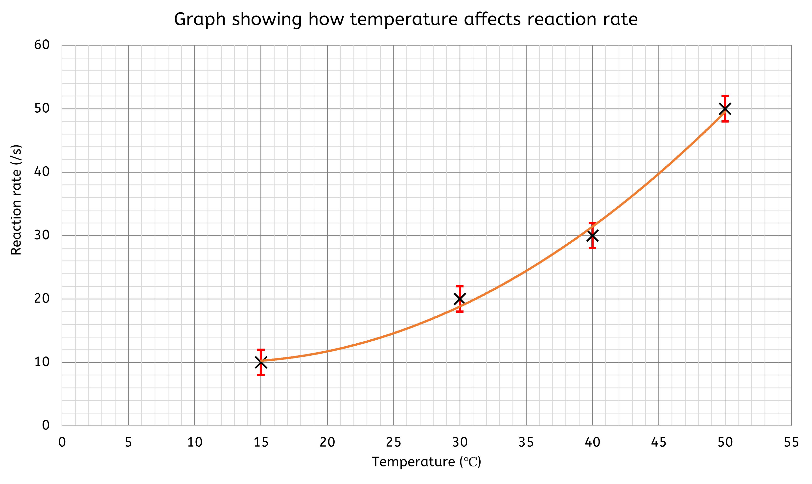
Uncertainty can be displayed on graphs using error bars, which indicate the range within which the true value is likely to fall. When plotting a point on a graph, the error bars extend both above and below the point. All repeat readings for each value of the independent variable are plotted, with vertical lines connecting these values to represent the uncertainty.
How to Plot a Graph
Plotting graphs is an essential skill in chemistry as it helps in visualising data and identifying trends. Here’s a step-by-step guide to plotting a graph:
- Choose the right type of graph, most of the time it will either be:
- Line graph: Used for continuous data, such as changes over time.
- Bar chart: Suitable for discrete or categorical data.
- Clearly label each axis with the variable name and its units (e.g., Temperature (°C), Time (s)):
- X-axis (horizontal): Typically represents the independent variable (the variable you change).
- Y-axis (vertical): Represents the dependent variable (the variable you measure).
- Choose an appropriate scale for each axis so that all your data points fit on the graph. The scale should be consistent (e.g., increments of 10, 5, etc.).
- Plot the data points:
- For each pair of values, find the corresponding position on the graph and mark it with a cross.
- If using a line graph, draw a line of best fit.
- If drawing a bar chart, each bar should be separate (not touching any other bar).
- Give your graph a descriptive title that explains what it shows (e.g., "Effect of Temperature on Reaction Time").
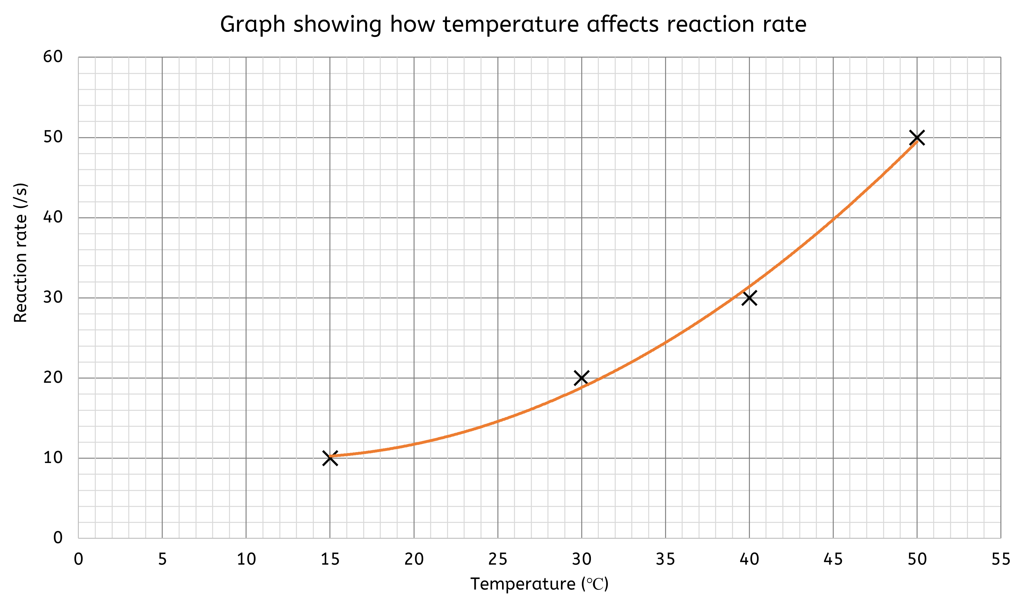
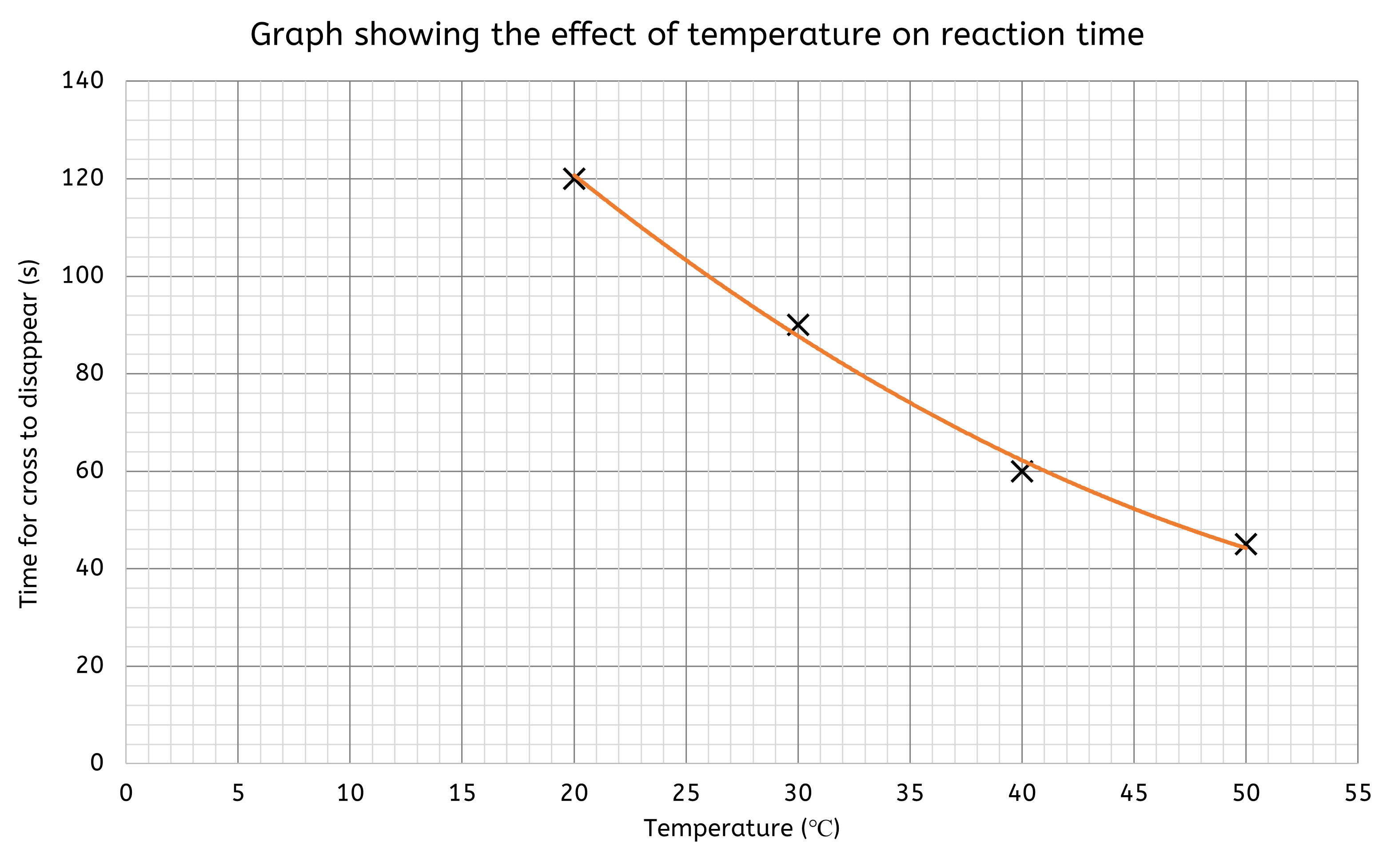
Worked Example - Plotting results on a graph
Hypothesis: "If the temperature of the reaction mixture increases, then the rate of reaction between sodium thiosulfate and hydrochloric acid will increase."
| Time for cross to disappear (s) | ||||
|---|---|---|---|---|
| Temperature (°C) | Run 1 | Run 2 | Run 3 | Mean time (s) |
| 20 | 125 | 115 | 120 | 120 |
| 30 | 85 | 95 | 90 | 90 |
| 40 | 55 | 65 | 60 | 60 |
| 50 | 50 | 40 | 100 | 45 |
- Choose a Line Graph: Since temperature and time are continuous variables.
- Set up the axes:
- X-axis: Temperature (°C)
- Y-axis: Time (s)
- Scale the axes to include all data points, for example:
- X-axis: 0 to 55 °C in increments of 5 (each small box is worth 1).
- Y-axis: 0 to 140 s in increments of 20 (each small box is worth 4).
- Plot the data points:
- Each point has an (X,Y) coordinate.
- X = the temperature value and Y = the time value
- (20, 120), (30, 90), (40, 60), (50, 45)
- Then add a title to the graph.
Analysing Results and Writing Conclusions
In chemistry, drawing conclusions from data is essential for understanding experimental results and verifying hypotheses. We often need to analyse results to draw conclusions, which involves interpreting graphs and tables to determine if the hypothesis is supported. The process of writing a conclusion includes summarising the findings, interpreting the data, relating the results to the hypothesis, and discussing the implications.
Data is often presented in graphical or tabular form. Translating data between these forms helps in better understanding and interpreting the results.
- In a linear graph, the gradient represents the rate of change of the dependent variable with respect to the independent variable. The y-intercept represents the initial value of the dependent variable when the independent variable is zero.
In a graph plotting the concentration of a reactant over time, the gradient indicates the rate of reaction. - In non-linear graphs, the gradient of a tangent to the curve at a specific point can measure the rate of change at that point. This is useful in reactions where the rate changes over time.
In a reaction rate graph, the tangent’s gradient at different times shows how the reaction rate changes as the reaction progresses.
What is a tangent, and how do I use it?
A tangent is a straight line that touches a curve at a single point without crossing it. The slope of the tangent at that point gives the rate of change of the curve. This is particularly useful in chemistry when analysing reaction rates that change over time.
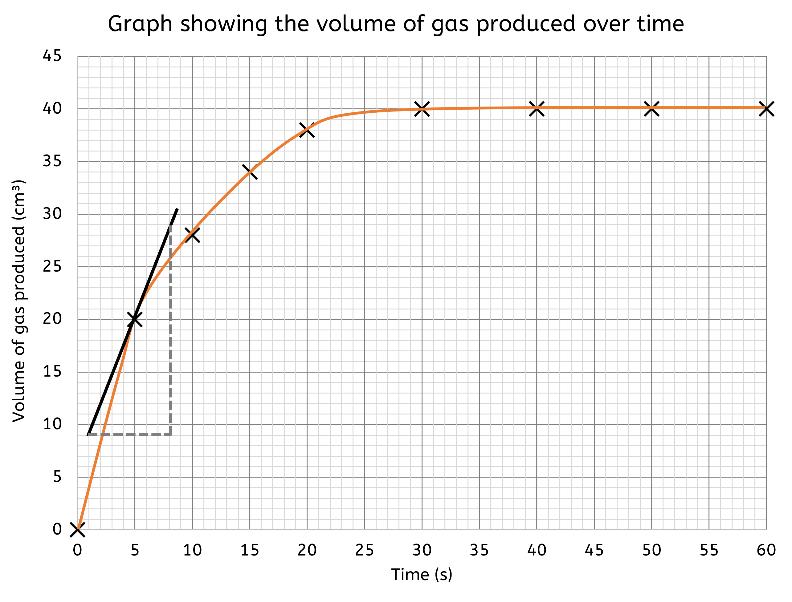
Drawing tangents can seem hard, but follow the following steps makes it much easier:
- Determine the exact point on the curve where you want to measure the rate of change. This is usually a point of interest where you need to know the instantaneous rate.
- Place a ruler so that it just touches the curve at this point without crossing it. Ensure the ruler is aligned in such a way that it touches the curve only at this one point and does not cut through the curve at any other point.
- Tip: Rotate the ruler gently until you find the position where it touches the curve exactly at one point. You can also move the ruler slightly back and forth to ensure it doesn't cross the curve.
- Draw a straight line along the edge of the ruler. This line should extend on both sides of the point of contact to create the tangent.
- Extend the line further on both sides to make sure it clearly represents the tangent to the curve.
- Measure the gradient of this tangent line to determine the rate of change at that point. The gradient can be calculated by finding the rise over run (change in y-axis value over change in x-axis value).
The gradient of the tangent provides an instantaneous rate of change at that specific point on the curve. For instance, in a reaction where the concentration of a product is changing over time, the tangent's gradient at any given moment indicates the rate at which the product is being formed at that particular time.
To write a conclusion:
- Start by briefly restating the main findings of your experiment. This helps to remind the reader of the crucial data points.
- Describe what the data shows in relation to the hypothesis. Explain the patterns, trends, or relationships observed in the data.
- Clearly state whether the data supports or refutes the hypothesis. Provide evidence from the data to justify your conclusion.
- If relevant, consider what the results mean for the broader scientific understanding. Discuss any potential implications or applications of your findings.
Worked Example - Writing a Conclusion
Hypothesis: "If the temperature of the reaction mixture increases, then the rate of reaction between sodium thiosulfate and hydrochloric acid will increase."
For example, in the disappearing cross experiment, you might conclude:
The data shows that increasing the temperature of the reaction mixture decreases the time for the cross to disappear. This supports the hypothesis that higher temperatures result in faster reactions. The trend observed indicates that temperature directly influences the reaction rate, which aligns with the theory that higher temperatures increase particle collisions, leading to faster reactions.
Evaluating Experiments
Evaluating an experiment involves assessing both the data and the method used. This includes evaluating the accuracy, precision, repeatability, and reproducibility of the data, as well as identifying potential sources of error.
- Accuracy refers to how close measurements are to the true value.
- Precision indicates how close repeated measurements are to each other.
- Repeatability is the consistency of results when experiments are repeated by the same person.
- Reproducibility is the consistency of results when experiments are repeated by different people.
Evaluating the method involves identifying sources of error and assessing how well variables were controlled. Suggesting improvements to the method can help improve accuracy and reliability in future experiments. Sometimes it might be relevant, or worthwhile, suggesting further experiments or investigations that should be conducted to either supplement your findings, or to answer any questions that may have arisen because of your findings.
Worked Example - Writing an Evaluation
Hypothesis: "If the temperature of the reaction mixture increases, then the rate of reaction between sodium thiosulfate and hydrochloric acid will increase."
For example, in the disappearing cross experiment, you might evaluation might be:
In the disappearing cross experiment, random errors such as slight temperature fluctuations may have affected the results. Systematic errors could include consistent inaccuracies in timing. To improve the experiment, using a magnetic stirrer for consistent mixing and conducting more repeats to calculate a more reliable mean would be beneficial.
Listen to this page (feature coming soon)
Did you know?
- The term "statistics" originates from the Latin word "status," meaning state or condition.
- Florence Nightingale, a pioneering nurse, was also a statistician who used data to improve sanitary conditions in hospitals.
- The first known use of graphs to represent data was by William Playfair, a Scottish engineer and political economist, in the late 18th century.
Why do we care?
- Collecting and analysing data helps us make informed decisions, from choosing the best phone plan to understanding climate change impacts.
- Accurate data collection and analysis are crucial for developing new treatments and medications.
- Athletes and coaches use data to track performance and improve training strategies.
- Scientists collect and analyse data to monitor pollution levels and protect natural habitats.
Key information
- Data collection involves gathering quantitative (numerical) and qualitative (descriptive) information during experiments.
- Quantitative data can be discrete (countable) or continuous (measurable). Qualitative data includes observations like colour changes or state changes.
- Outliers that do not fit the expected pattern should be identified and considered during analysis.
- Random errors are unpredictable variations that can be reduced by averaging multiple measurements.
- Systematic errors are consistent inaccuracies that need to be corrected through calibration and standardisation.
- Graphs and charts (line graphs, bar charts, pie charts) are used to present data clearly and effectively.